Colours are never chosen at random. They shape the emotion, the energy and the way your guests will experience, and remember, your day. In the world of weddings, the colour palette is a true common thread: it structures the atmosphere, enhances the venue and creates visual harmony between the decor, the stationery, the flowers and the outfits.
As a wedding planner in Nouvelle-Aquitaine, I help couples in Bordeaux and across the Bordeaux region create elegant, coherent moodboards designed around the season, the style they want and their identity as a couple. Thanks to the psychology of colour, it is possible to compose an atmosphere that perfectly reflects your story while enhancing your wedding.
Here is how to choose your ideal palette according to the season, the symbolism of colours and their emotional impact.
Spring: softness, renewal and romance
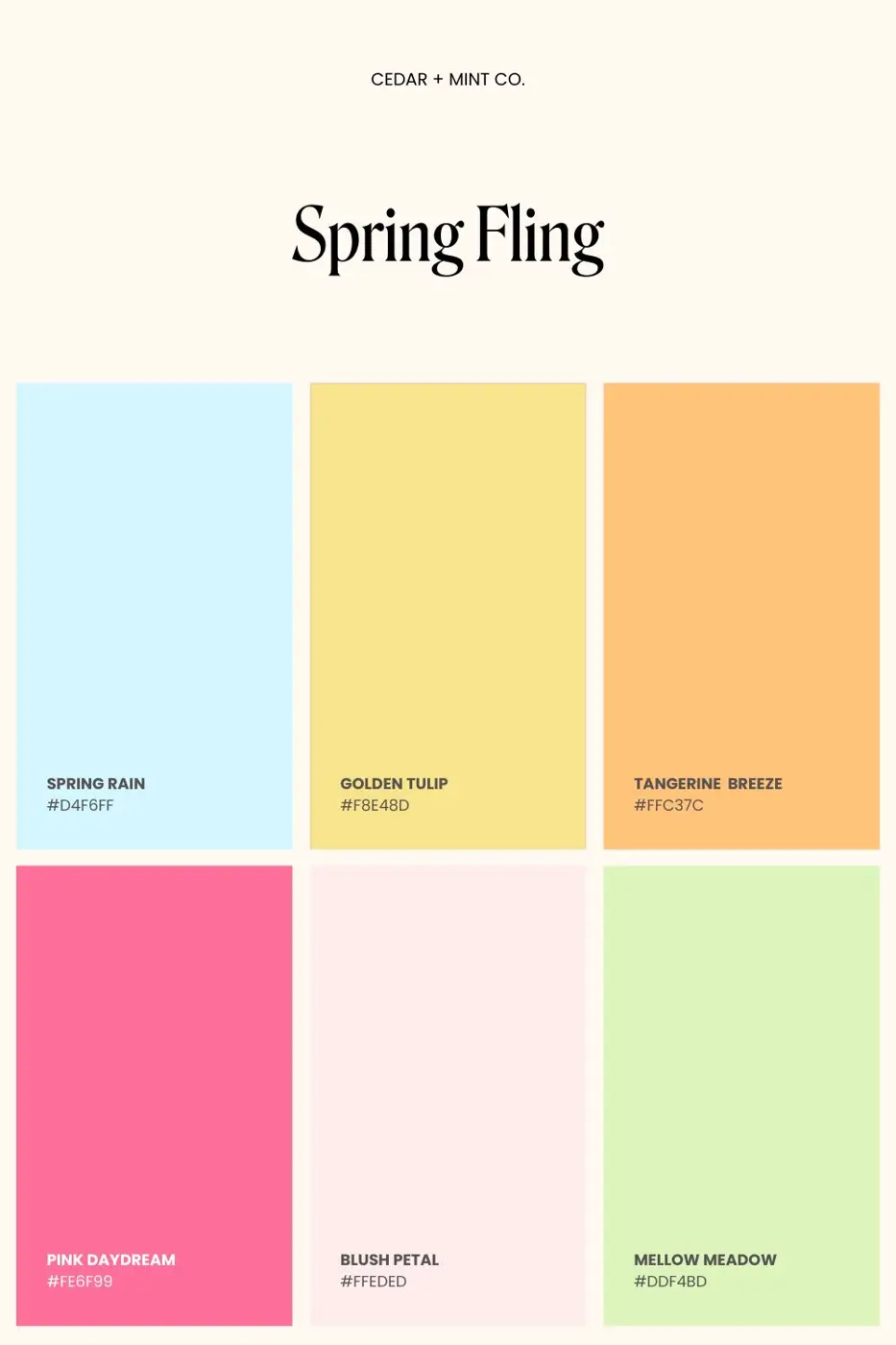
Spring is a particularly popular season for weddings in Nouvelle-Aquitaine. Nature wakes up, the light softens and the landscapes take on fresh, delicate colours. This period naturally symbolises renewal, promise and the beginning of a new story together. It lends itself perfectly to a romantic, elegant and luminous celebration, especially at a wine estate or château around Bordeaux.
Ideal palette
- Dusty pink
- Sage green
- Lavender
- Ivory
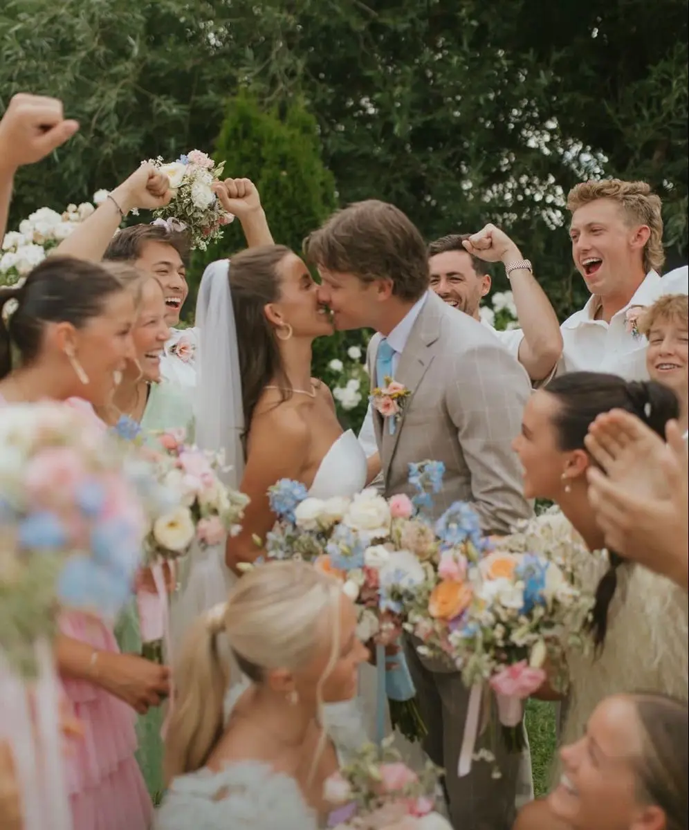
These pastel shades make up a subtle, harmonious palette. Dusty pink brings a romantic, timeless touch, ideal for flowers, ribbons or stationery. Sage green, very much on trend in wedding decor, balances the whole with a natural, botanical note. Lavender, soft and slightly powdery, evokes the landscapes of the South West and enhances spring floral decor. Finally, ivory brings light and elegantly ties everything together.
Emotional impact
A spring wedding evokes freshness, lightness and delicacy. Pastel tones create a soothing, luminous atmosphere, perfect for an intimate, warm ambience. This palette is particularly suited to outdoor ceremonies, country receptions or boho-chic weddings in the Bordeaux region.
Guests feel a sense of softness and serenity, while the photographs benefit from natural light that enhances pale colours and flowing fabrics.
Colour symbolism
Choosing colours in spring is not only about looks, it is also full of meaning:
- Dusty pink: a symbol of tender, sincere and delicate love.
- Sage green: represents balance, harmony and a connection to nature.
- Lavender: associated with serenity, gentleness and inner peace.
Combining these shades creates a spring wedding palette that is elegant, natural and deeply romantic, in perfect harmony with the season and the setting.
Summer: energy, light and conviviality
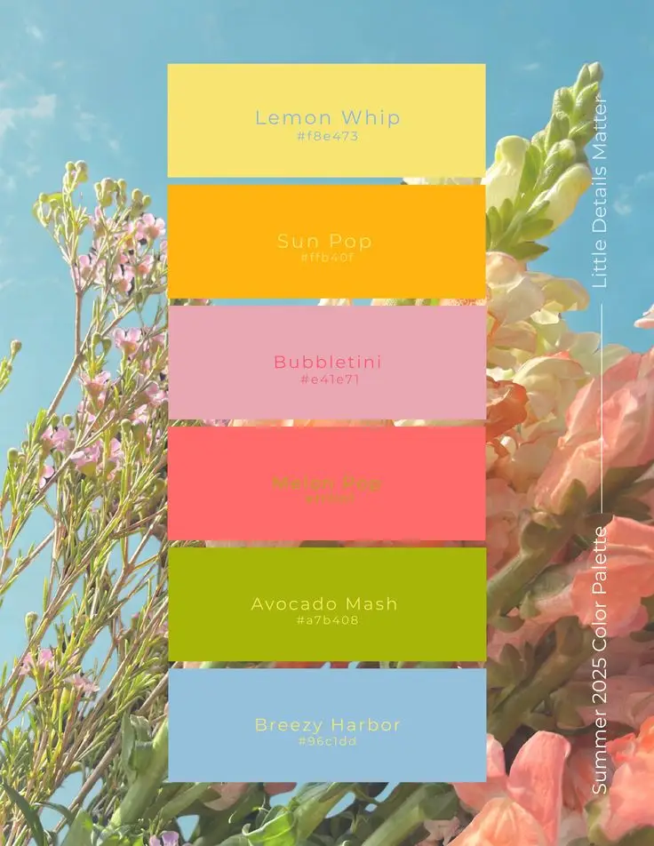
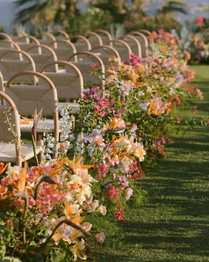
Summer is the season of intense light, long evenings outdoors and warm celebrations. In Nouvelle-Aquitaine, it offers an exceptional setting for a wedding at a château near Bordeaux, a wine estate or out in nature. The warmth of the sun, the golden landscapes and the festive atmosphere inspire vibrant, sunny and elegant palettes.
A summer wedding stands out for its energy and generosity. The colours chosen should reflect that energy while keeping a certain sophistication. The goal is to create a bright, convivial and memorable atmosphere, perfectly suited to the season.
Ideal palette
- Terracotta
- Coral
- Deep burgundy
- Gold
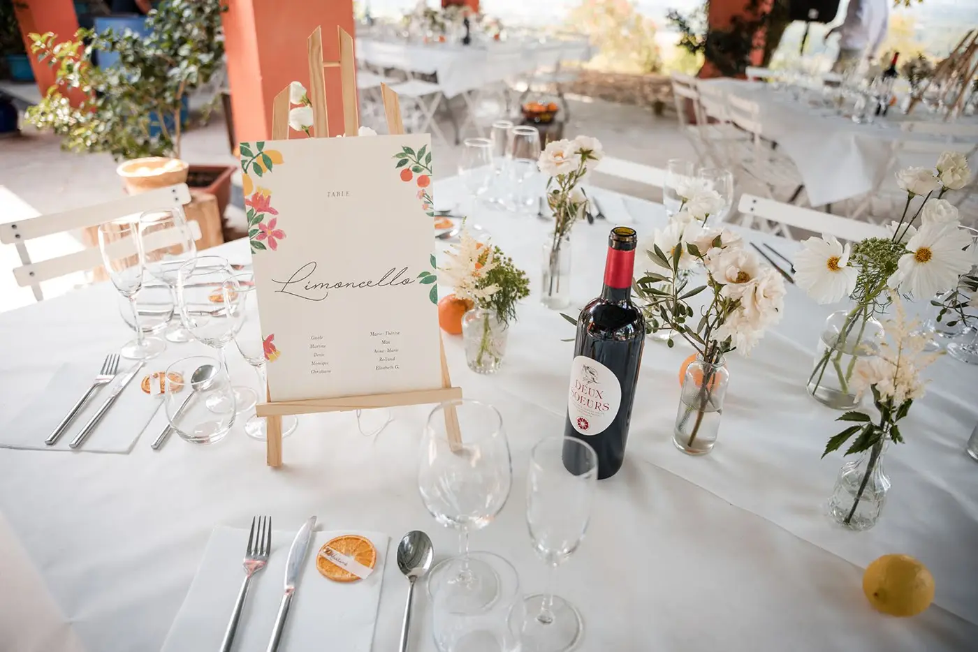
Terracotta, very popular in wedding decor, brings natural warmth and a Mediterranean touch. Coral lights everything up with freshness and modernity, ideal for floral arrangements or stationery. Deep burgundy gives the palette structure and adds an elegant, refined dimension, particularly suited to receptions at characterful venues. Finally, gold enhances every detail: tableware, candleholders, signage or styling elements.
This combination creates a bold yet balanced summer wedding palette, perfect for a chic, sunny atmosphere.
Emotional impact
Warm colours naturally stimulate joy, enthusiasm and conviviality. They encourage a festive atmosphere, ideal for conversation, laughter and moments shared outdoors.
At a summer wedding in the Gironde, these shades sit beautifully against the golden stone of Bordeaux châteaux and the surrounding vineyards. They heighten the feeling of human warmth and emotional intensity, while creating a spectacular backdrop for sunset photos.
Colour symbolism
Each shade carries a strong meaning:
- Terracotta: a symbol of authenticity, naturalness and warmth.
- Deep burgundy: embodies passion, depth of feeling and timeless elegance.
- Gold: evokes refinement, success and light.
Combined with care, these colours make it possible to design a bright, sophisticated summer wedding, both vibrant and elegant, in perfect harmony with the energy of the season.
Autumn: elegance and intensity
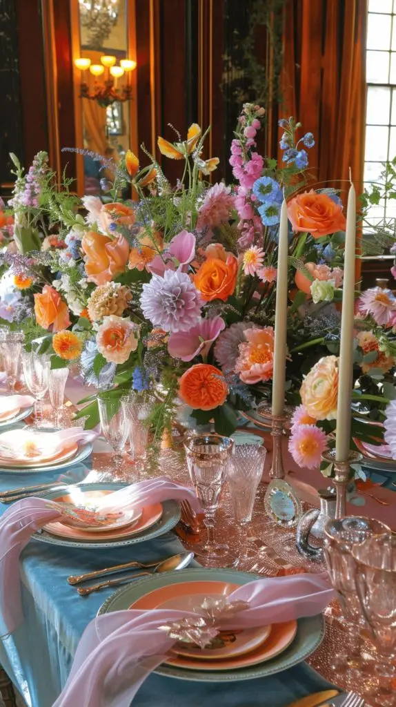
Autumn is a particularly refined season for a wedding in Nouvelle-Aquitaine. The vineyards turn warm shades, the light becomes more golden and the atmosphere gains depth. This period inspires hushed, sophisticated and warm ambiences, ideal for a chic wedding at a château or wine estate in the Bordeaux region.
An autumn wedding appeals through its enveloping character. The colours are richer and more textured, allowing a rich, elegant scenography. The season lends itself perfectly to noble materials such as velvet, heavy linen, raw wood or patinated metal.
Ideal palette
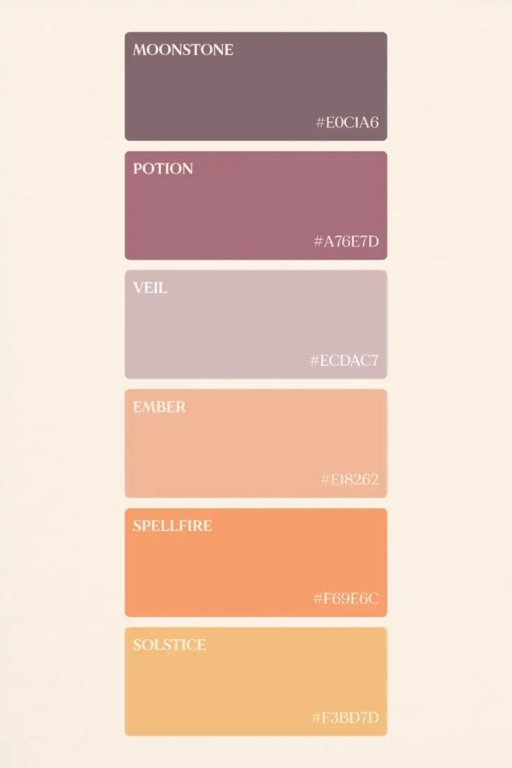
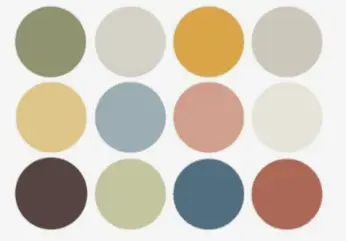
- Plum
- Copper
- Forest green
- Warm beige
Plum brings depth and intensity, perfect for structuring the floral decor or the stationery. Forest green reinforces a natural elegance and creates a harmonious contrast with the greenery. Copper subtly lights up the whole with its warm reflections, especially on candleholders, cutlery or decorative details. Finally, warm beige balances the palette by bringing softness and light.
This combination forms an autumn wedding palette that is both sophisticated and warm, ideal for an intimate reception.
Emotional impact
Autumn evokes maturity, depth of feeling and authenticity. These shades create an enveloping, intimate ambience, ideal for elegant ceremonies and candlelit dinners.
In the Bordeaux region, they blend naturally with the golden stone of old buildings and vineyard landscapes in shifting colours. The result is an atmosphere that is chic, warm and intensely romantic.
Colour symbolism
Each shade reinforces the character of the season:
- Plum: a symbol of mystery, nobility and refinement.
- Forest green: represents stability, grounding and strength.
- Copper: embodies warmth, conviviality and generosity.
Combining these shades creates an elegant, deep autumn wedding, in perfect harmony with the season and the natural surroundings of the Gironde.
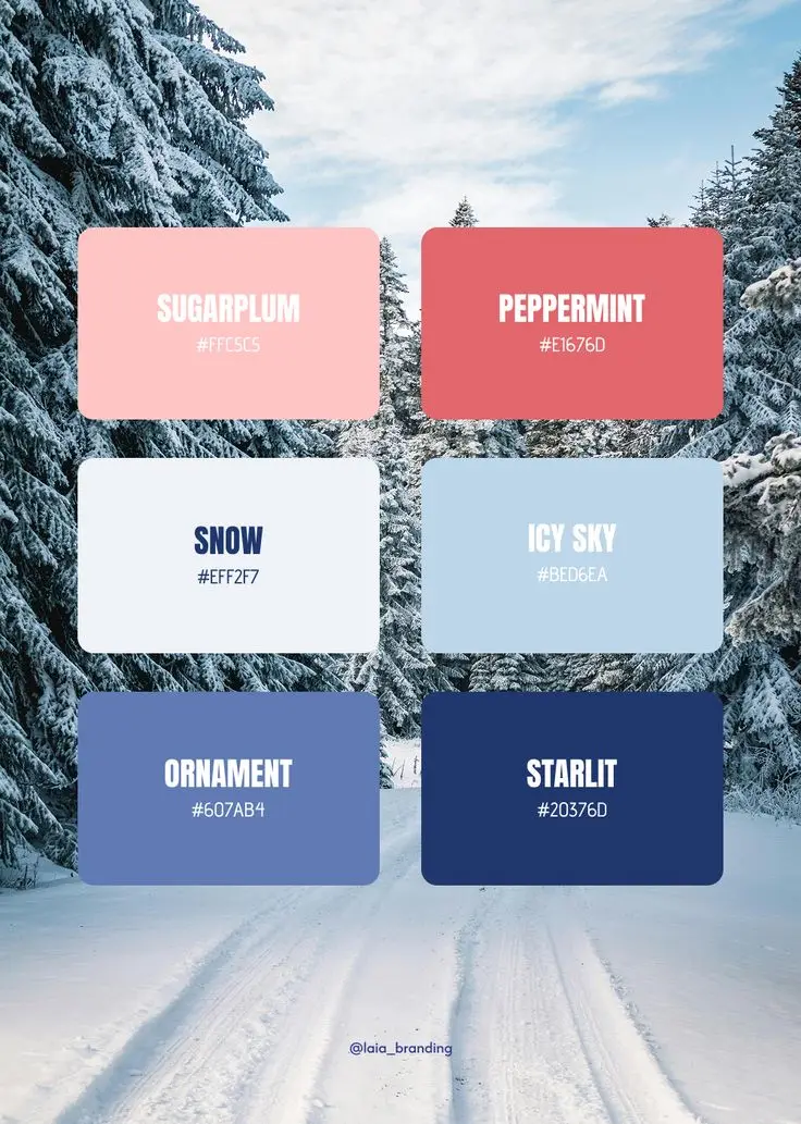
Winter: modernity and refinement
Winter is an ideal season for a sophisticated, elegant wedding in Nouvelle-Aquitaine. Shorter days and soft light offer an intimate setting, perfect for a chic, contemporary atmosphere. Winter weddings let you dare more contrasting, luxurious colour combinations while showing off the venue, whether a Bordeaux château, a modern hall or an intimate wine estate.
This period calls for understated yet striking palettes that convey modernity, refinement and timeless elegance. The materials can heighten this sophistication: velvet, satin, crystal and metallic elements combine harmoniously for an elegant, luminous result.
Ideal palette
- Pure white
- Midnight blue
- Silver
- Gold
Pure white symbolises purity and brings light, essential to contrast with the wintry mood. Midnight blue adds depth and a modern touch, ideal for structuring the decor or accessories. Metallic touches of silver and gold bring prestige, elegance and refinement, on the stationery, tableware, candles or decorative pieces.
This combination forms a chic, harmonious winter palette, perfectly suited to indoor weddings or celebrations in soft, low light.
Emotional impact
Winter colours create a sophisticated, contemporary atmosphere. They convey a feeling of confidence, prestige and serenity, while offering guests a warm setting despite the cold outside. The contrast between bright white and the deep tones of midnight blue heightens the elegance of the photos and enhances every decorative detail.
Colour symbolism
- Pure white: purity, simplicity and light.
- Midnight blue: depth, confidence and modernity.
- Silver / Gold: prestige, refinement and sophistication.
By choosing these shades, you can create a modern, refined winter wedding, where every detail contributes to an elegant, memorable scenography in perfect harmony with the cold season in Bordeaux and its region.
How to create your perfect colour moodboard
Creating a colour moodboard is an essential step in planning and designing your wedding. It is a visual tool that gathers and harmonises every element of your decor to achieve a coherent, elegant atmosphere. With it, you can see the balance between the stationery, the flowers, the tableware, the outfits, the decor and the lighting before you even finalise your choices.
A well-designed moodboard makes communication easier with your wedding planner, your florists, your decorators and every supplier involved. It helps anticipate colour combinations, avoid clashes and guarantee a harmonious atmosphere that reflects your identity and the mood you want for your big day.
A professional method in 5 steps
- Define the main emotion: start by identifying the atmosphere you want to convey: romantic, festive, minimalist or warm. This emotion will guide all your colour decisions.
- Choose a main colour: select the shade that will be the common thread of your wedding and will appear in the key elements of the decor.
- Add 2 or 3 complementary colours: these shades will enrich your palette, create subtle contrasts and strengthen the visual harmony.
- Bring in a texture: pair your colours with specific materials such as linen, velvet, wood or metal. These textures add depth and character to your decor.
- Test the coherence in natural light: look at your palette at different times of day to make sure the colours stay harmonious whatever the light, soft or bright.
By following this method, you can design a balanced, elegant colour moodboard that is true to your vision, so that every detail of your wedding contributes to a harmonious, memorable scenography.
The impact of colour on your guests
Colours play a major role in how your guests perceive and experience the day. They subtly influence the overall atmosphere of your wedding and help create lasting emotions. Depending on the shades you choose, you can encourage conviviality, intimacy or elegance.
- Warm tones: reds, coral, terracotta or golds stimulate energy and encourage a festive, lively atmosphere. They are ideal for summer weddings or outdoor celebrations.
- Cool tones: blues, greens or purples bring elegance and serenity, creating a calmer, more sophisticated setting, perfect for winter or indoor weddings.
- Neutral tones: ivory, beige, white or light grey convey a timeless refinement that suits any venue and any season.
When planning my weddings in Nouvelle-Aquitaine, I take care to adapt each colour palette to local specifics:
- The natural light according to the season and the orientation of the venue, which affects how shades are perceived.
- The venue, whether a historic château, a wine estate, a beach or a contemporary space.
- The Bordeaux season, so that the chosen colours are in harmony with the surrounding landscape and the local weather.
The colour palette is therefore not just an aesthetic choice: it becomes a strategic tool to create the ideal atmosphere, move your guests and enhance every moment of your wedding.
Neutral colours: elegance and simplicity
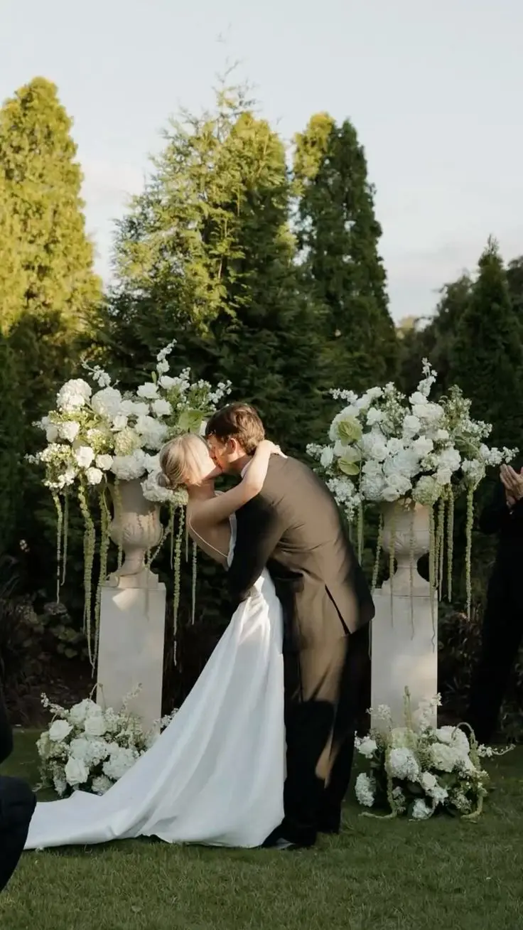
Neutral colours have become a must in wedding decor. They bring refinement, harmony and balance to your palette, while serving as a base to set off bolder shades. These tones offer an ideal backdrop for the flowers, stationery, tableware and textures you choose.
Among the most popular neutrals:
- White and ivory: bring brightness and purity, perfect for a classic or minimalist wedding.
- Beige and sand: offer warmth and softness, creating an intimate, natural atmosphere.
- Light grey and stone: add modernity and sophistication, ideal for contemporary or urban weddings.
Neutrals are extremely versatile. They can be paired with pastels for a romantic look, with warm tones for a convivial mood, or with deep colours for an elegant contrast. In every case, they bring coherence and balance to your decor while letting the decorative and floral elements stand out fully.
On-trend colour combinations
For a modern, elegant wedding, some colour combinations have been particularly popular in Nouvelle-Aquitaine in recent years:
- Terracotta + Sage green + Ivory: ideal for a boho-chic or country style, blending warmth and naturalness.
- Dusty pink + Lavender + Gold: perfect for a romantic, luminous spring wedding.
- Burgundy + Copper + Warm beige: well suited to autumn, combining depth, elegance and warmth.
- Midnight blue + Silver + Pure white: a sophisticated choice for an elegant, modern winter wedding.
- Coral + Pale yellow + Leaf green: on trend for summer, this palette brings energy, light and conviviality.
These combinations create a harmonious, contemporary scenography while adapting to the season, the venue and the desired mood. They also offer great flexibility to bring in a variety of textures and materials, giving each wedding a unique, memorable style.
Why get expert help choosing your colours
Choosing your wedding colour palette may seem simple, but it is in fact a strategic step that shapes all of your decor and the atmosphere of the day. A poorly balanced palette can quickly create visual imbalance and reduce the overall impact of your scenography.
A poor colour combination can weigh down the decor, create inconsistent contrasts and weaken the visual effect of the photos, making the whole look less harmonious. The details that should enhance your wedding may then go unnoticed or give an impression of clutter.
Working with a wedding planner in Bordeaux and across the Bordeaux region gives you a professional, experienced eye. By designing personalised moodboards, it is possible to guarantee perfect harmony between the emotion, the season and the couple's identity. Every decorative element, from the flowers to the accessories, stationery and lighting, fits into a coherent palette, creating an elegant, memorable atmosphere.
Expert guidance turns the choice of colours into a real asset: it structures the decor, enhances your photos and helps make your wedding a harmonious, unique and carefully considered event.
In short...
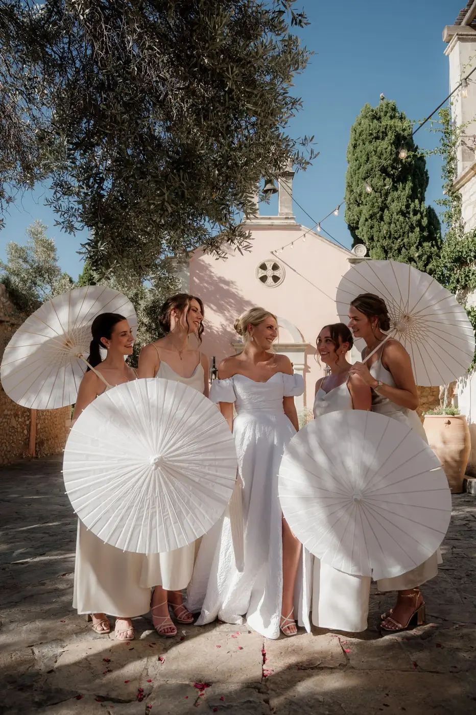
Choosing the colours for your wedding is not just a question of looks: it directly shapes the atmosphere, your guests' emotions and the harmony of every detail. Whether you opt for soft tones in spring, warm colours in summer, deep shades in autumn or sophisticated palettes in winter, every shade tells a story and helps create a unique world for your big day.
Working with a wedding planner in Bordeaux and Nouvelle-Aquitaine lets you design a coherent, personalised colour moodboard suited to your style, the season and the venue. This approach guarantees a harmonious, elegant and memorable scenography, where every element, flowers, decor, stationery or lighting, helps enhance your wedding and leave unforgettable memories.
In the end, a well-thought-out palette turns your celebration into a complete visual and emotional experience, with elegance and harmony present at every moment.